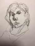
Here are some of the paintings I made for this exercise. Experimenting with unusual media and using collections of ordinary objects was a great experience. Together, these two aspects of the exercise led me to make some abstract paintings with elements of representation (and vice versa!); in other words, I felt freed from the need for a painting to be one or the other!
Here’s what I did :
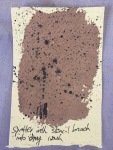
Ice – Paint with ice or on ice. Experiment with effect of ice, paint and salt
Painting on ice – painting with time-based outcomes – transition from solid to liquid, from marks and lines drawn to organic shapes as ice melts. From figurative to abstract. As the ice melts, multiple variations of the painting form. Take a print on paper of the painted ice sheet, and take a print on to the ice of a painting on paper, and watch it melt. Try drawing with inktense, artbar, charcoal and graphite. Try painting with watercolour, acrylic, gouache.
I froze some sheets of ice in a baking tray lined with cling film. Also tried lining with bubble wrap for a different surface to paint on.
A thinner sheet broke as I handled it, and I used the two smaller pieces to paint on to.
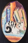
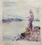
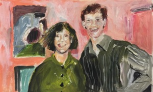
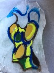
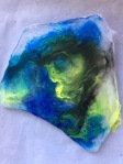
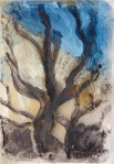
First this one below, using my swimming costumes image as reference, with watercolour, adding inktense pencil and artbar crayons as it melted. Greens, blues and yellows seemed suited to the subject as well as to the support
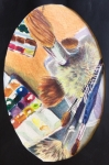
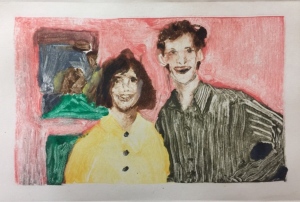
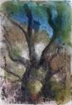
Then this one below; the ice having already melted slightly when I began, watercolour appeared too wishywashy. I turned to acrylic ink applied with pipette. Later added inktense crayon, then green ink applied with turkey baster.
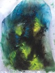
I found it mesmerising to observe as the surfaces melted and colours softened, merged, formed bright veins of pigment which followed their own mysterious tracks, perhaps to do with the texture of the cling film impression on the ice. I actually like the broken, irregular shape of the ice sheets (calling to mind David Dipre’s paintings on broken shards of pottery) and their edges, and I like the pigment-free parts of the ice around the edges. What a wonderful concept to develop further. I could see the morphing of the image as the ice melts as a metaphor for change, decay, loss.
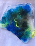
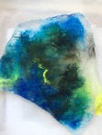
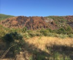
Next I used images from a collection of photos I made on the day following a forest fire. I picked up lumps of charcoal, and photographed the charred landscape. A few weeks afterwards I returned and found green shoots – the landscape was regenerating itself. Here are some of the photos I took at the scene:-
I had in mind when I took the photos that some day I’d paint a series showing the landscape burnt and regenerating…little did I know I’d be representing my idea on melting ice! Painting fire (or the results of it) on ice seemed poetic. As the ice melts, the parched landscape cools, green starts to appear, then flowers, blossom and more fresh foliage recreate the forest.
The initial painting was done picking up grated, tinted charcoal (picked up at the site of the fire) and graphite with a brush. As the ice surface started to melt I started grating more black, white and coloured charcoal, graphite, inktense and artbar crayon directly onto the surface. My image changed, developed until the barren scene had become a blurred, frest, rainy forest.
The photographs here become the work of art. I would display the prints on a wall as above, showing the transitions and developments from stage to stage.
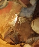
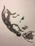
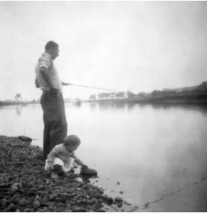
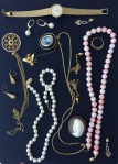
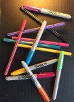
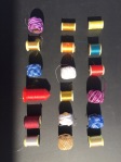
Painting with ice – I half-froze diluted acrylic ink, acrylic paint, watercolour, gouache, China ink, pastel pigment, in plastic pill organisers, stuck a cocktail stick in as a handle, and put them back to finish freezing. Prepared some black and some white A3-A4 surfaces, donned some latex gloves, and had my images of collections of cotton reels, pens and socks in front of me. I extricated the ice cubes from the little containers, and started by holding the cocktail sticks and pushing the cubes around but soon got stuck in with my fingers. In any case the cocktail sticks came away as the ice melted, so then I stamped and pushed the melting cubes around with my hands. I mixed colours and media, working fast, responding to the images in front of me, but relinquishing any idea of replicating them…the idea of them was all I could hope for as the ice was melting quickly. When all the frozen paint had melted away I found that by mixing very liquid pigments and different media, interesting puddles were developing on my uneven surfaces. As these slowly dried, pigment granulated out producing some beautifully subtle variegated washes.
I liked the feel of the slushy, creamy-textured paint as it melted. The watery washes are gorgeous, the unpredictable element exciting. These are the source images for the paintings above
Coffee
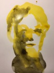
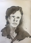
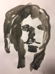
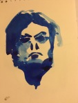
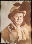
Paul Westcombe paints with coffee, on his brightly coloured coffee cups. This portrait, of my great grandfather, Walter Percy Cook, from a collection of old family photographs, was made quickly in my sketchbook with instant coffee, which felt like watercolour or ink to use. I was very pleased by its simplicity and the sepia look; the painting is not a bad likeness either. I like the grittiness of undissolved granules here and there. – I always find it hard not to be seduced by colour, so it’s nice to use a monochrome media.


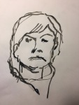
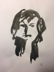
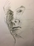
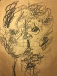
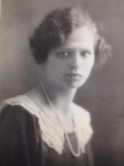
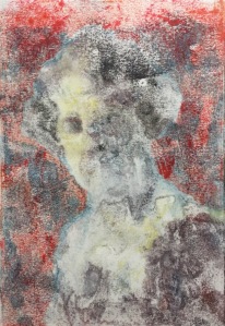
I struggled more with the great-grandmother, Henrietta Millgate (should have stopped earlier) – this is on rough watercolour paper, showing how the initial painting responded to soaking in water, then with final adjustments. The faded version in the middle looks pleasingly enigmatic…the memory of a face fading with time perhaps?
Pomegranate juice
Now is the season for pomegranates, so knowing it’s staining quality I squeezed some juice from the seeds of two types; my own fruit yielded a bright carmine pink, and my neighbour’s, a different species, was virtually colourless, although irresistibly sweet tasting. I made a tryout on watercolour paper, using the carmine coloured juice; pomegranate concentrate; diluted red pepper purée; diluted paprika; and the pale pomegranate juice. The paprika and purée were lumpy, but could be mixed smooth another time. The molasses dried sticky and glossy, it has such a high sugar content. Any of these colours could be painted onto an icing surface, as could coffee, chocolate and food colouring. I may be making a Christmas cake soon…

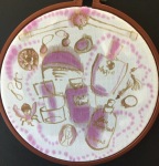
However, for now I wanted to try painting my perfume bottles and jewellery collections with the pomegranate juice onto fabric. I mounted a piece of hand-woven cotton in an embroidery frame and painted it with a pva glue solution first (I thought this would make the fabric less absorbent). The colour seeped through the threads of the loose weave before it was dry, and lost all intensity. I tried again with a tighter weave, an old embroidered cotton napkin, without pva this time – this time the colour stayed carmine-pink, although by the time the fabric was dry the objects were quite blurred. Next I tried polyester cotton shirt fabric. I drew the main objects with coffee and a brush, then added pomegranate to depict strings of beads and to colour the objects.the coffee lines remained sharp and gave the painting definition, while the carmine coloured juice spread and softened. The result is decorative and delicate, apt for the subjects’ ornamental character.
I’m excited by the circular format (I’ve since found Craig Donald’s installation with a painting similarly mounted in an embroidery frame, here – on black fabric). It made a refreshing change, and challenged me to search for a different sort of composition (as did the ice shards ground). The painting is offset well by the black background, but with hindsight may have been a tad better on a deep brown, complementing the deep coffee coloured lines. Painting on fabric is lovely – I’ve always loved working with fabrics and I like the feel of it in my hands. There’s much scope for experimentation with ground, media and technique here.
Marble dust, pasta, cloves, chilli seeds – Antoni Tapies mixed various earthy materials into paint… and incorporated objects such as string, cloth, paper. His paintings grew on me the more I studied them. There’s a preponderance of subtle earth tones, no bright colour, which I find very attractive, but hard to avoid the siren call of bright colour in my own work (see below!)
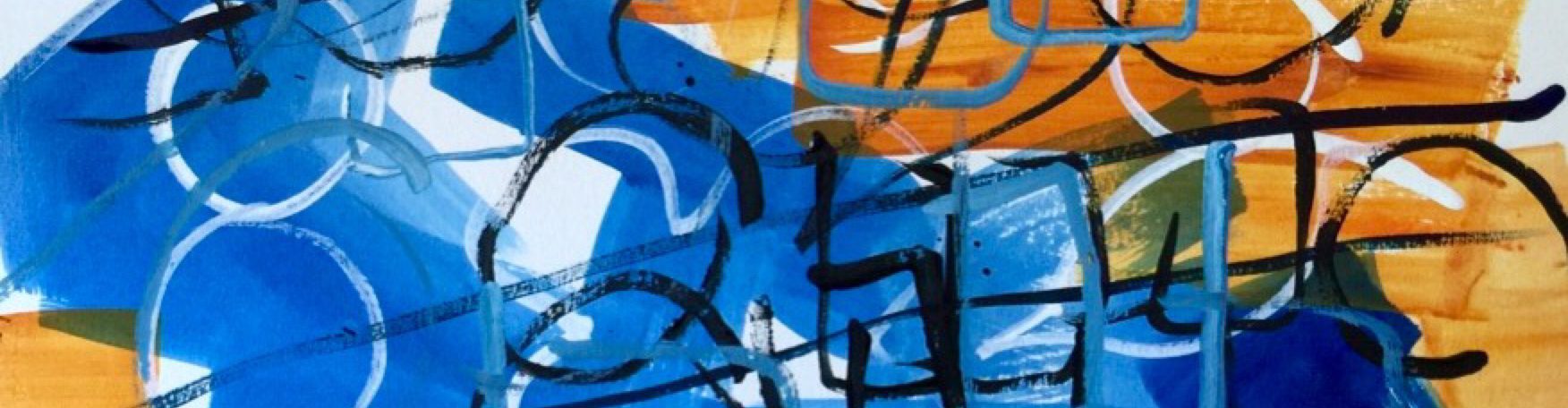
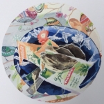
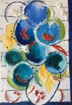
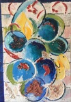
I went out and bought a kilo of white marble dust from a local industrial estate. It turned out to be quite coarse and gritty (I’d like to find or make a finer dust so I can make my own gesso & putty – see recipes at bottom of post), good for creating rough texture or textured relief on my support, when mixed with pva and water (and white acrylic paint) in different proportions. I applied a fluid mixture onto an old 35x50cm canvas, creating a rough all-over white surface, then applied the same mixture with blue and yellow paint using a palette knife to create circular shapes. They reminded me of my image of a collection of plates, so I decided at this point to develop the painting using that image as my source of inspiration.


I continued by adding gobs of a very stiff mixture of the marble dust at random over the canvas, creating a 3D relief surface, then pressed paint-tube-rings of dried acrylic paint into the thick paste. With my palette knife, with some difficulty I made 3D arcs of paste for the rims of plates. After drawing dark lines and circles – the planks of the table top, and the edges of plates – I remembered some good sketchbook work I did in POP1, involving mixing stuff into paint, so raided the kitchen and mixed chilli seeds, vermicelli, cloves, soup pasta into paint and spread it onto the ‘plates’. Some of the textures I skimmed over with a contrasting colour to highlight them, creating depth in the valleys. Work in progress gallery below.
I felt a bit like a builder on a small scale, trowelling on cement mix, and found the feel and sound of the gritty mixture a bit hard and jarring. My painting has all-over texture, giving it an earthy, granular look and feel which I’m not all that fond of, but it seems to work ok here.
Would enjoy studying the work of Tapies in more detail, and developing the concept of building other materials into paintings.
Recipes
Putty recipe – marble dust plus paint medium (acrylic medium or linseed oil) plus (optional) egg yolk. Mix paint into the putty to extend and make it lighter, without whitening it.
Clear gesso recipe – 83g water, 63g marble dust, 120g pva glue (e.g. For making a toothed surface)
White gesso recipe – Add 125g pva glue to 250g water. Whisk in 750g marble dust gradually. Whisk in 120 ml white paint. Adjust thickness by adding more marble dust or more liquid. I tried this but the result was very coarse, I need to find finer marble dust for a smoother gesso finish for general use.
References
https://www.artsy.net/artwork/antoni-tapies-2
http://cargocollective.com/craigdonaldartist/Presently-Millennium-Court-Arts-Centre-2014
https://www.tadspurgeon.com/puttytutorial.php
https://aegeancenter.wordpress.com/tag/marble-dust/
https://youtu.be/8FVRyB3d8WY (how to make clear gesso)
https://youtu.be/k9olqnIU5QQ (how to make white gesso)
Acrylic Paint On Fabric: The Easiest Way To Make And Use It